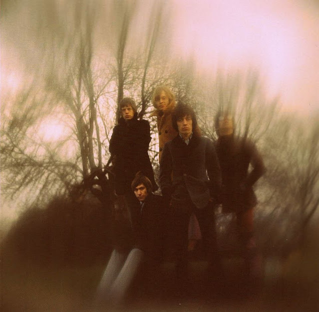
Between the Buttons was the fifth British and seventh American studio album of the Rolling Stones. It was the first Stones album ever to use identical cover art for both album versions. Released in the UK on January 20, 1967 and in the US on February 11, 1967 it is also the first Rolling Stones album cover to have a splash of natural color. It’s a cover that people remember, the Stones in overcoats on a cold day. It’s a little trippy.
The photo shoot for the album cover took place in November 1966 on Primrose Hill in North London. The photographer was Gered Mankowitz, who also shot the band photos for the cover of Out of Our Heads. The shoot took place at 5:30 in the morning following an all night recording session at Olympic Studios. Using a home-made camera filter constructed of black card, glass and Vaseline, Mankowitz created the effect of the Stones dissolving into their surroundings. The goal of the shoot was, in Mankowitz’s words, “to capture the ethereal, druggy feel of the time; that feeling at the end of the night when dawn was breaking and they'd been up all night making music, stoned.”
Mankowitz said, “I think I contributed a lot when I did the cover of the album Between the Buttons. My contribution in the earlier sessions was based more on an honesty, a desire to communicate something about the Stones as people and not try and mask their personalities with any sort of technical or theatrical embellishments. I think that that’s why (their manager) Andrew (Loog Oldham) liked the pictures and why the band were happy to work with me for such a long period of time, because I photographed them as they were. And then when it came to Between the Buttons, I felt confident enough as a photographer and in my relationship with them to actually make a contribution... I don’t think I did a conceptual cover until, you know, late in ’66 when I did Between the Buttons.”
This was an era when album covers were becoming a true artform. Gazing at the images could enhance the listening experience. The synestesia of listening to a new album while cover gazing and turning on was “a thing” for many a Stones fan. Mankowitz said, “I recognized the importance of the record cover as it was as the fan’s primary link with the band. I always treated it as an artform while working within the limitations. And there were limitations; record companies printed the images on the same cardboard used for toilet rolls. Yet in many ways I think myself and other photographers working at that time set down a blueprint for the album cover, one which is still in use by music photographers today.”
The back cover of Between the Buttons is dominated by a six-panel cartoon accompanied by a rhythmic poem drawn by drummer Charlie Watts. When Watts asked Oldham what the title of the album would be, he told him it was “between the buttons,” a term meaning “undecided.” Watts gave the phrase to the title of his cartoon which in turn became the title of the album. On the album cover itself, the band name and album title appear on the buttons on Watts’ overcoat. Often difficult to see, this text was included blown-up on a hype-sticker affixed to original US pressings and would also be added to the bottom corners of the artwork for several CD and LP reissues.
Keith Richards said, “Between the Buttons was the first record we made when we hadn’t been on the road and weren’t shit-hot from playing gigs every night. Plus, everyone was stoned out of their brains... Between the Buttons was the first time we took a breath and distanced ourselves a little from the madness of touring and all. So, in a way, to us it felt like a bit of a new beginning. But not everybody was in great shape. Brian was starting to be wonky at the time.” In 1969 Mick Jagger added, “Between the Buttons is my least favorite Stones album. I didn’t like none of it. I can't even remember doing it.”


Stones: We want to look cold, wet, and bored.
ReplyDeleteMankowitz: NAILED IT!
As far as I know, Gered Mankowitz started the photo session already at 5.30 in the morning, so it's no wonder they looked cold, wet and bored.
ReplyDelete